S-Sign offers the capability to collect more than just signatures in e-signature requests. This document will explain the different S-Sign field types that you can insert into your documents to collect signer information. There are currently seven different field types available: Signature, Text, Checkbox, Initials, Date, Picklist (from text), and Picklist (from field).
Signature Fields
The signature field comprises the core functionality of S-Sign: it will create a link that opens the S-Sign signature pad when clicked. In the template editor for templates that are S-Sign enabled, the signature field menu looks like this.
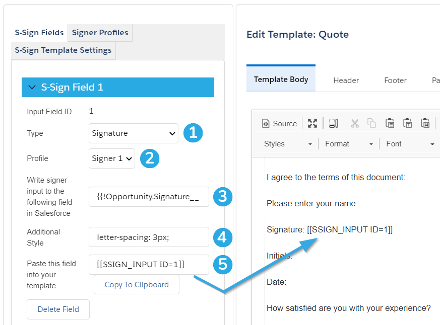
[1] Set the field type to Signature to create a signature field.
[2] Choose which signer profile should interact with this field.
[3] Choose a Salesforce text field to write this data back to. You can use the Insert Field button at the top of the template editor to obtain the correct merge field syntax. Be sure to match the Salesforce field type with the input field type (e.g. write input text fields back to Salesforce text fields, date fields to Salesforce date fields, etc.)
[4] Add additional styling for the signature input box as it appears to the end user on the signable document. This field accepts CSS syntax with semicolons. Note that you can use the letter-spacing property, which is not normally supported by Salesforce.
[5] Paste this tag into your template where you would like this signature field to appear.
Signature fields look like this to the signer:

Text Fields
A text field will appear as a blank box that the signer can type into. The text field menu looks like this in the template editor:

[1] Set the field type to Text to create a text field.
[2] Choose which signer profile should interact with this field.
[3] Make this field required or optional.
[4] Allow the signer to create new lines. By default, text input fields only accept one line.
[5] Choose a Salesforce text field to write this data back to. You can use the Insert Field button at the top of the template editor to obtain the correct merge field syntax. Be sure to match the Salesforce field type with the input field type (e.g. write input text fields back to Salesforce text fields, date fields to Salesforce date fields, etc.)
[6] Specify a default value for this field. You can even use merge fields and Named Query fields here.
[7] Choose a standard currency formatting. This option cannot be used with custom preformatting.
[8] Preformat the input for this field. Use # for numerical characters and X for non-numerical characters (e.g. a phone number would look like '(###) ###-####') Note that the input length will be restricted to the number of characters entered here. This option cannot be used if currency formatting is used.
[9] Edit the height of the text input box as it appears to the end user on the signable document. Use any CSS length unit without semicolons.
[10] Edit the width of the text input box as it appears to the end user on the signable document. Use any CSS length unit without semicolons.
[11] Add additional styling for the text input box as it appears to the end user on the signable document. This field accepts CSS syntax with semicolons. Note that you can use the letter-spacing property, which is not normally supported by Salesforce.
[12] Paste this tag into your template where you would like this text field to appear.
Text fields look like this to the signer:

Checkbox Fields
Checkbox fields are fairly self-explanatory: a checkbox will appear where this field tag is placed. The checkbox field menu looks like this in the template editor:
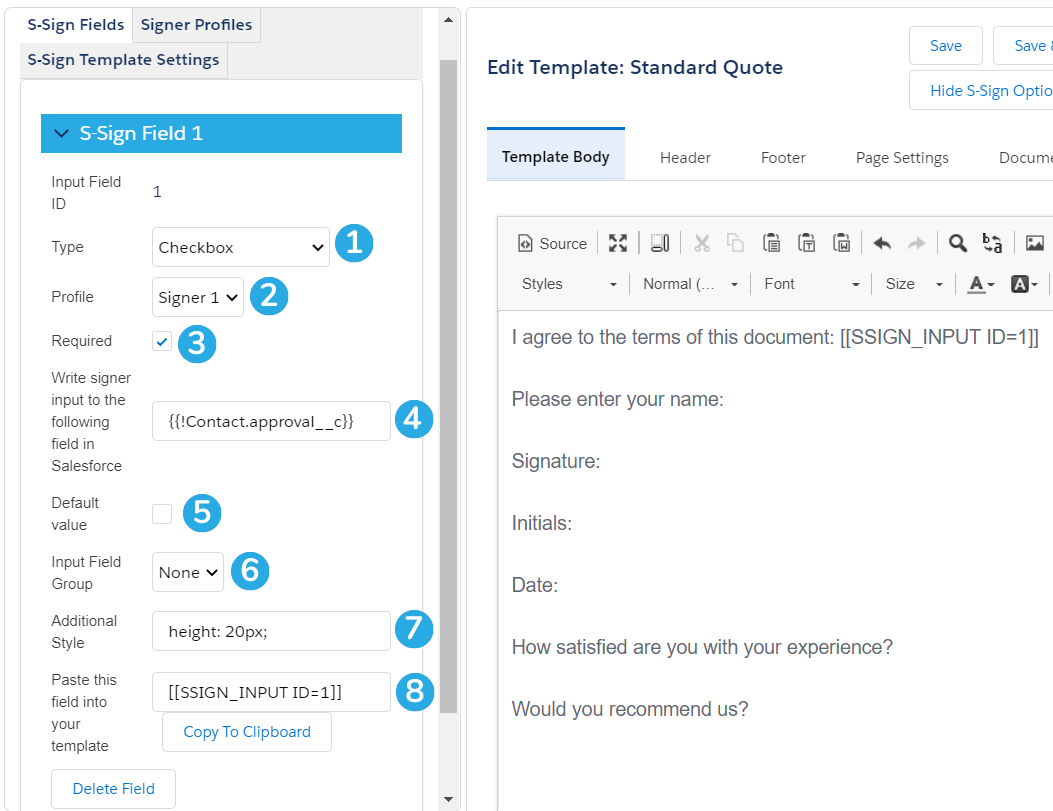
[1] Set the field type to Checkbox to create a checkbox field.
[2] Choose which signer profile should interact with this field.
[3] Make this field required or optional.
[4] Choose a Salesforce checkbox field to write this data back to. You can use the Insert Field button at the top of the template editor to obtain the correct merge field syntax. Be sure to match the Salesforce field type with the input field type (e.g. write input text fields back to Salesforce text fields, date fields to Salesforce date fields, etc.)
[5] Specify a default value for this field (checked or unchecked).
[6] Assign this field to an input field group. Input field groups allow you to group different checkbox fields together and set requirements for the group as a whole. Input field group settings are found in the S-Sign Template Settings menu.
[7] Add additional styling for this field. This field accepts CSS syntax.
[8] Paste this tag into your template where you would like this checkbox field to appear.
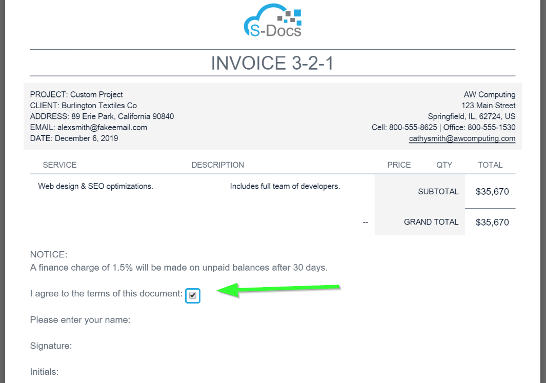
Checkbox fields look like this to the signer:
Initials Fields
The initials field type creates a link similar to the signature field type. Clicking the link brings up a variation of the signature pad for initials. Signers can either draw their initials, or use the Text to Signature feature and type them. The initials menu looks like this in the template editor:
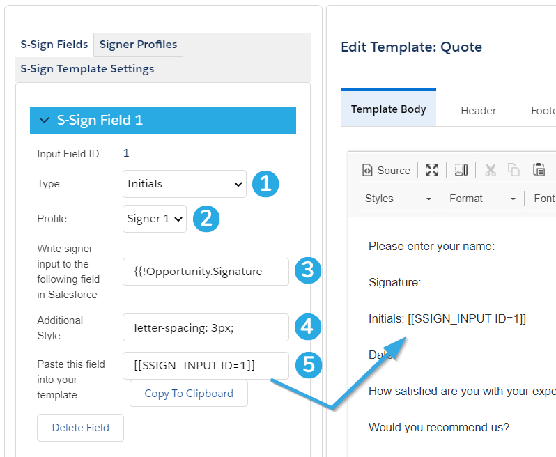
[1] Set the field type to Initials to create an initials field.
[2] Choose which signer profile should interact with this field.
[3] Choose a Salesforce field to write this data back to. You can use the Insert Field button at the top of the template editor to obtain the correct merge field syntax. Be sure to match the Salesforce field type with the input field type (e.g. write input text fields back to Salesforce text fields, date fields to Salesforce date fields, etc.)
[4] Add additional styling for the initials input box as it appears to the end user on the signable document. This field accepts CSS syntax with semicolons. Note that you can use the letter-spacing property, which is not normally supported by Salesforce.
[5] Paste this tag into your template where you would like this initials field to appear.
Initials fields look like this to the signer:

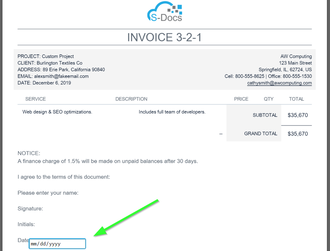
Date Fields
Date fields allow the signer to input a date. They look like this in the template editor:

[1] Set the field type to Date to create a date field.
[2] Choose which signer profile should interact with this field.
[3] Make this field required or optional.
[4] Choose a Salesforce date field to write this data back to. You can use the Insert Field button at the top of the template editor to obtain the correct merge field syntax. Be sure to match the Salesforce field type with the input field type (e.g. write input text fields back to Salesforce text fields, date fields to Salesforce date fields, etc.)
[5] Specify a default date value for this field. A calendar will appear and allow you to choose a date when you click inside this box in the S-Sign panel.
[6] Edit the height of the date input box as it appears to the end user on the signable document. Use any CSS length unit without semicolons.
[7] Edit the width of the date input box as it appears to the end user on the signable document. Use any CSS length unit without semicolons.
[8] Choose to let this field be automatically populated with the date that the document is submitted.
[9] Choose a format for how the date will appear in the final document.
[10] Add additional styling for the date input box as it appears to the end user on the signable document. This field accepts CSS syntax with semicolons. Note that you can use the letter-spacing property, which is not normally supported by Salesforce.
[11] Paste this tag into your template where you would like this date field to appear.
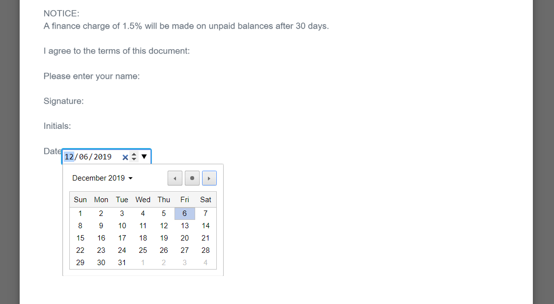
Date fields look like this to the signer:
When clicked, a calendar will appear for the signer to choose a date from.
Picklist Fields
Picklist field types allow the signer to choose from a list of options. There are two types of picklist fields available: picklists from text, and picklists from fields.
Picklists From Text
Picklists from text are comprised of options that you input manually. The picklist from text menu looks like this in the template editor:
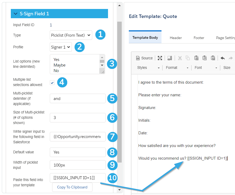
[1] Set the field type to Picklist (From Text) to create a picklist from text field.
[2] Choose which signer profile should interact with this field.
[3] Enter a new-line-delimited list of options for your picklist.
[4] Choose to make your picklist multi-select by allowing multiple options.
[5] Specify a delimiter for the picklist output data. This only applies if you checked the Multiple list selections allowed checkbox described in #4. By default, the data will be displayed as a comma-delimited list.
[6] Specify how many picklist options can be shown on screen at once. A scrollbar will appear within the picklist for the user to view all options. By default, all picklist options will be shown on screen at once.
[7] Choose a Salesforce field to write this data back to. You can use the Insert Field button at the top of the template editor to obtain the correct merge field syntax. Be sure to match the Salesforce field type with the input field type (e.g. write input text fields back to Salesforce text fields, date fields to Salesforce date fields, etc.)
[8] Specify a default value for this field.
[9] Edit the width of the picklist input box as it appears to the end user on the signable document. Use any CSS length unit without semicolons.
[10] Paste this tag into your template where you would like this picklist field to appear.
Picklist (from text) fields look like this to the signer:

Picklists From Field
Picklists from field are comprised of options from an existing Salesforce picklist field. The picklist from field menu looks like this in the template editor:
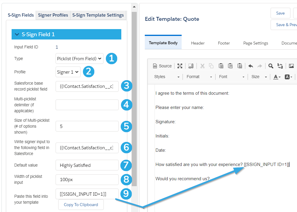
[1] Set the field type to Picklist (From Field) to create a picklist from field field.
[2] Choose which signer profile should interact with this field.
[3] Specify an existing picklist field from your base record whose options should be displayed within your S-Sign document. You can use the Insert Field button at the top of the template editor to obtain the correct merge field syntax.
[4] Specify a delimiter for the picklist output data. This only applies if your picklist is multi-select. By default, the data will be displayed as a comma-delimited list.
[5] Specify how many picklist options can be shown on screen at once. A scrollbar will appear within the picklist for the user to view all options. By default, all picklist options will be shown on screen at once.
[6] Choose a Salesforce field to write this data back to. You can use the Insert Field button at the top of the template editor to obtain the correct merge field syntax. Be sure to match the Salesforce field type with the input field type (e.g. write input text fields back to Salesforce text fields, date fields to Salesforce date fields, etc.)
[7] Specify a default value for this field.
[8] Edit the width of the picklist input box as it appears to the end user on the signable document. Use any CSS length unit without semicolons.
[9] Paste this tag into your template where you would like this picklist field to appear.
In this example, we used a merge field that points toward a custom field on our opportunity record that we'd like to use in our S-Sign document.
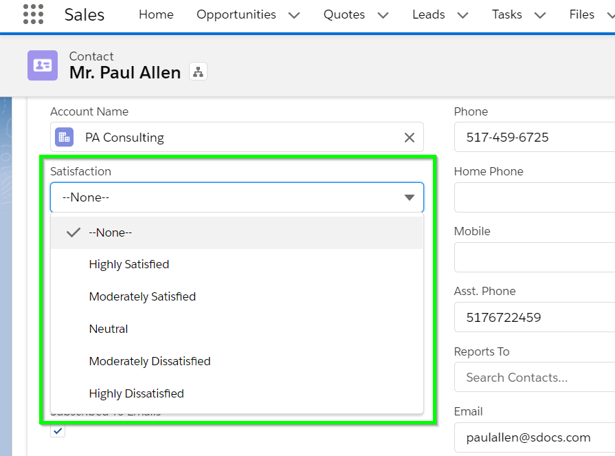
Picklists (from field) look like this to the signer:

With these seven field types, you are ready to optimize your e-signature workflow and start gaining more value from your S-Sign requests.